

swiftui-flx
SwiftUI components you paste and own.
A shadcn/ui-style design system for SwiftUI: open source components you add to your app with one command and then own completely.
Website · Components · Installation · Presets
Why swiftui-flx
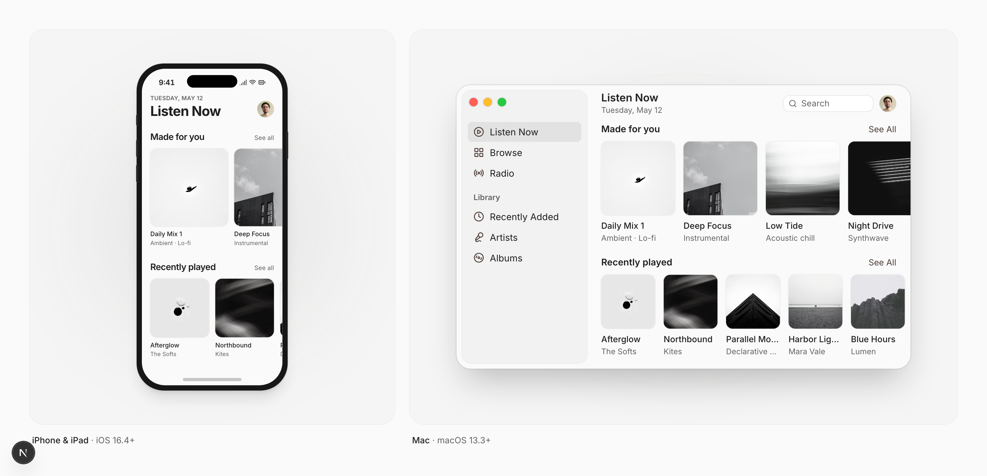
swiftui-flx follows the shadcn/ui approach: instead of adding a dependency, you add the source to your project. From then on it's your code, ready to adapt to your app.
- You own the code. No dependency to update or work around. Change anything.
- Built on native SwiftUI. Components wrap
Button,Toggle,Slider,DisclosureGroupand friends, styled through their own*Styleprotocols, so you keep native behavior. - Follows Apple's metrics. Sizes, spacing and controls follow the Human Interface Guidelines on each platform. A Toggle is a switch on iPhone and a checkbox on Mac.
- Accessible. Built with Dynamic Type and VoiceOver in mind.
- Themes and dark mode. Every component reads from shared tokens. Switch presets or bring your own colors in one place.
- iPhone, iPad and Mac. Docs, previews and examples for each platform.
Quick start
Using Claude Code, Cursor or Codex? Copy the Install with AI prompt, or point your agent to llms.txt. Adding to an existing app? See Existing Projects.
Add the foundation once, then the components you need. Run from your app's source folder, or pass --cwd (details):
npx shadcn@latest add https://swiftui.flexnative.com/r/foundation.json --cwd MyApp
npx shadcn@latest add https://swiftui.flexnative.com/r/ios-button.json --cwd MyApp
Use mac-button.json for macOS. Prefer not to use the CLI? Every component page has the source to copy by hand.
import SwiftUI

struct SettingsView: View {
    @State private var notifications = true

    var body: some View {
        FLXCard {
            FLXCardHeader {
                FLXCardTitle("Notifications")
            }
            FLXCardContent {
                FLXToggle("Allow notifications", isOn: $notifications)
            }
            FLXCardFooter {
                FLXButton("Save", variant: .primary) {}
            }
        }
    }
}
Components
| Component | iOS & iPadOS | macOS | |
|---|---|---|---|
| Avatar | ✓ | ✓ | Profile picture with an initials fallback |
| Badge | ✓ | ✓ | Small label for status, category or count |
| Button | ✓ | ✓ | Primary, outline, secondary, ghost and link variants |
| Card | ✓ | ✓ | Container with header, content and footer |
| Collapsible | ✓ | ✓ | Content that expands and collapses |
| Field Label | ✓ | ✓ | Caption paired with a form control |
| Form Field | ✓ | ✓ | Label, control, description and error together |
| Item | ✓ | ✓ | List, notification and settings rows |
| Menu | ✓ | — | Actions revealed from a button |
| Picker | ✓ | — | Dropdown to pick one value |
| Progress View | ✓ | ✓ | Progress bar or spinner |
| Secure Field | ✓ | ✓ | Password input |
| Sheet | ✓ | ✓ | Content presented over the current view |
| Slider | ✓ | ✓ | Pick a value from a range |
| Text Editor | ✓ | ✓ | Multi-line text input |
| Text Field | ✓ | ✓ | Single-line text input |
| Text Field Group | ✓ | ✓ | Text field with leading and trailing addons |
| Toggle | ✓ | ✓ | Switch on iOS, checkbox on macOS |
On macOS, Menu and Picker use SwiftUI's native versions, which the Mac always draws itself.
Requirements
- iOS and iPadOS 16.4 or later, or macOS 13.3 or later
- Swift 5 or Swift 6 language mode
- The shadcn CLI to install components, or nothing at all if you copy them by hand
FAQ
Why not a Swift package? Packages are great for shared logic. For UI, having the source lets you shape each component to your app's design and change it whenever you need.
Do I need a web project or Node?
Only npx to run the shadcn CLI. Nothing from the web ends up in your app. The files are plain Swift.
Does it work with my existing design?
Yes. Change the tokens in DesignSystem/Theme or apply a preset with .flxTheme(_:) to any part of your app.
Development
This repo powers swiftui.flexnative.com and hosts the component registry.
pnpm install
pnpm dev
pnpm registry:build
Swift sources live in registry/. pnpm registry:build generates the installable files in public/r. See CONTRIBUTING.md to try a change in an app and for the rules every component follows.
Credits
Inspired by shadcn/ui. Built by Felipe Menezes.
If swiftui-flx saves you time, a star helps other SwiftUI developers find it.
License
The components and design system in registry/ are licensed under the MIT license. Use them in any app, commercial or not.
Everything else in this repository, including the website, is licensed under the AGPL-3.0 license.