
Lucian UX/UI Prompt
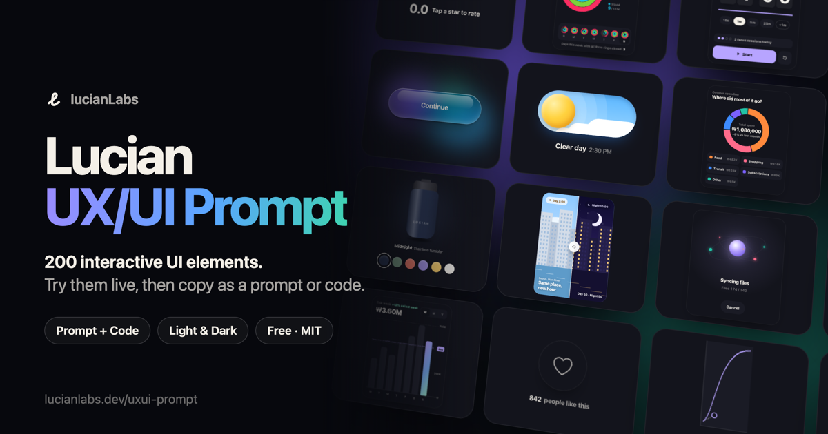
200 interactive UI elements you can try live, then take into your project as an AI prompt or as working code. Every element supports light and dark themes, pointer, touch and keyboard input, and reduced motion. No dependencies.
Live gallery: lucianlabs.dev/uxui-prompt
How to use
- Open the gallery and try an element. Each one plays a short demo when it scrolls into view, and you can take over at any time.
- Press Copy prompt. The prompt contains the element's full working code plus porting instructions.
- Paste it into your AI coding tool (Claude Code, Cursor, Codex, …), fill in
[Insertion point](and[Replacement target]if you are replacing something), and send.
The agent first checks your framework, styling and theming setup, then ports the element into a component, maps the --ux-* color tokens to your theme variables, and reports what it changed and what it could not check.
If you'd rather port it yourself, Copy code gives you the raw HTML, CSS and JS, and Download code saves a standalone HTML file with a theme toggle.
To link to a specific element, add its number: https://lucianlabs.dev/uxui-prompt/#001.
Use it from an AI coding agent
Install the lucian-uxui skill, and your agent can search the library and port elements by itself:
npx skills add Seokwoooo/lucian-uxui
Then ask something like "Build a landing page for my coffee subscription. Use the lucian-uxui skill and prefer its elements." The skill reads the static data in api/v1/, which is generated from src/elements and also served at https://lucianlabs.dev/uxui-prompt/api/v1/.
Run locally
All you need is Node.js. There are no packages to install.
git clone https://github.com/Seokwoooo/lucian-uxui-prompt.git
cd lucian-uxui-prompt
node src/build.mjs
open prompt-uxui-lab/index.html
The build checks every element and writes the whole gallery into one self-contained HTML file.
Element format
Each element is a single file, src/elements/NNN-slug.html:
<!-- @meta {"title":"…","category":"버튼","summary":"…","hint":"…","shape":"square","tags":["button"]} -->
<!-- @demo [["wait",400],["tap",".u001-btn"],["wait",1200]] -->
<!-- @en {"title":"…","summary":"…","hint":"…","map":[["계속하기","Continue"]]} -->
<style>.u001{…} .u001-btn{…}</style>
<div class="ux u001">…</div>
<script>(() => { const root = document.currentScript.previousElementSibling; … })();</script>
@meta: title, category and summary. Korean is the source language.@demo: steps for the autoplay demo (wait,tap,hover,glide,drag,type, …).@en: English title and summary, plus a string map that localizes the element's code.- Every CSS selector is scoped to
.uNNN, and the script finds its root throughdocument.currentScript, so elements never leak into each other. - Colors come only from the
--ux-*tokens insrc/tokens.css, which define both light and dark values.
node src/build.mjs rejects any file that breaks these rules.
License
MIT © 2026 Seokwoooo. You can use the elements in personal and commercial projects. Code copied from the gallery starts with a one-line comment that credits the source and names the license. Please keep it in your file.