

Bubble Card
 Read this in your language (Français, Deutsch, Español, 简体中文, 日本語... and much more)
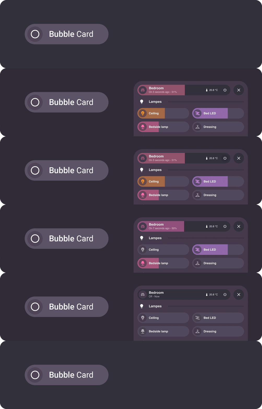
Bubble Card is a minimalist and customizable card collection for Home Assistant, featuring modern pop-ups and an integrated Module Store with over 100 community-made modules.
Table of contents
Installation Configuration Pop-up Horizontal buttons stack Button Media player Cover Select Climate Calendar Separator Empty column Sub-buttons only Sub-buttons Entity suggestions Card layouts Conditions Actions Styling Templates Modules Localization Help Contributing Donate
Installation
Home Assistant lowest supported version: 2023.9.0
Without HACS
- Download this file: bubble-card.js
- Add this file to your
<config>/wwwfolder. To get the editor in your language, downloadbubble-card-<lang>.jsonfrom the dist folder as well, for examplebubble-card-fr.json, and put it next tobubble-card.js(without it the editor stays in English) - On your dashboard click on the icon at the right top corner then on
Edit dashboard - Click again on that icon and then click on
Manage resources - Click on
Add resource - Copy and paste this:
/local/bubble-card.js?v=1 - Click on
JavaScript ModulethenCreate - Go back and refresh your page
- You can now click on
Add cardin the bottom right corner and search forBubble Card - After any update of the file you will have to edit
/local/bubble-card.js?v=1and change the version to any higher number
If it's not working, just try to clear your browser cache.
With HACS (Recommended)
This method allows you to get updates directly on the Home Assistant Community Store
- If HACS is not installed yet, download it following the instructions on https://hacs.xyz/docs/setup/download/
- Proceed to the HACS initial configuration following the instructions on https://hacs.xyz/docs/configuration/basic
- On your sidebar go to "HACS"
- Search for "Bubble Card", or click on the blue button below
- Click on "Download"
- Go back on your dashboard and click on the icon at the right top corner then on
Edit dashboard - You can now click on
Add cardin the bottom right corner and search forBubble Card
If it's not working, try to clear your browser/app cache (on all your devices if needed).
Videos
You can also take a look at my YouTube channel for step by step videos.
Configuration
All options can be configured in the Home Assistant editor. But you can find more details and the YAML in the documentation below.
Main options (YAML + description)
| Name | Type | Requirement | Supported options | Description |
|---|---|---|---|---|
type |
string | Required | custom:bubble-card |
Type of the card |
card_type |
string | Required | button, calendar, climate, cover, empty-column, horizontal-buttons-stack, media-player, pop-up, select, separator or sub-buttons |
Type of the Bubble Card, see below |
styles |
object list | Optional | Any CSS stylesheets | Allows you to customize your Bubble Card CSS, see styling |
Global CSS variables (see Styling)
| Variable | Expected value | Description |
|---|---|---|
--bubble-border-radius |
px |
Border radius for all supported elements |
--bubble-main-background-color |
color |
Main background color for all supported elements |
--bubble-secondary-background-color |
color |
Secondary background color for all supported elements |
--bubble-accent-color |
color |
Accent color for all supported elements |
--bubble-icon-border-radius |
px |
Icon border radius for all supported elements |
--bubble-icon-background-color |
color |
Icon background color for all supported elements |
--bubble-sub-button-border-radius |
px |
Border radius for all sub-buttons |
--bubble-sub-button-background-color |
color |
Background color for all sub-buttons |
--bubble-box-shadow |
see box shadow | Box shadow for all supported elements |
--bubble-border |
see border | Border for all supported cards |

Check out this video to learn about Bubble Card and its capabilities. My YouTube channel is quite new and focuses on tutorials about Home Assistant and Bubble Card. Don’t hesitate to subscribe to help increase my channel’s visibility. Thank you in advance!
Pop-up

This card allows you to create a pop-up with any content. Each pop-up is hidden by default and can be opened by targeting its link (e.g. '#pop-up-name'), with any card that supports the navigate action, or with the horizontal buttons stack that is included.
Tip
Pop-up trigger
This feature allows you to open a pop-up based on the state of any entity, for example, you can open a "Security" pop-up with a camera when a person is in front of your house. You can also create a toggle helper (input_boolean) and trigger its opening/closing in an automation.
Opening a pop-up when a binary_sensor is on
type: custom:bubble-card
card_type: pop-up
hash: '#kitchen'
name: Security
icon: mdi:video
trigger_entity: binary_sensor.front_door_motion
trigger_state: 'on'
trigger_close: true
Different ways to close a pop-up
They are many ways to close a pop-up. For instance, you can swipe from the pop-up header to the bottom, by doing a long swipe inside the pop-up to the bottom, by pressing Escape on desktop, by removing the hash in the URL or by simply pressing the close button.
Pop-up options
Options (YAML + descriptions)
| Name | Type | Requirement | Supported options | Description |
|---|---|---|---|---|
hash |
string | Required | Any unique hash (e.g. '#kitchen') with ' ' |
This is how you will open your pop-up |
popup_style |
string | Optional | bubble (default), classic or home-assistant |
Define the pop-up visual style |
popup_mode |
string | Optional | default (default), fit-content, centered or adaptive-dialog |
Define the pop-up layout mode. With popup_style: home-assistant, only default (full height on mobile, like the "More info" panel) and adaptive-dialog (fits its content on mobile) are used. |
with_bottom_offset |
boolean | Optional | true or false (default) |
Only used with popup_mode: fit-content or adaptive-dialog, and with popup_style: home-assistant. Applies a bottom offset on mobile, useful when your dashboard includes a footer card. |
full_width_on_mobile |
boolean | Optional | true or false (default) |
Only used with popup_mode: centered. Expands the pop-up to full screen width on mobile, useful on smaller displays. |
performance_mode |
string | Optional | default (default) or performance |
Optimize the pop-up open animation. performance slightly delays content rendering and background blur, also disables backdrop blur if set. |
auto_close |
string | Optional | A timeout in milliseconds (e.g. 10000 for 10s) |
Auto close the pop-up after a timeout |
close_on_click |
boolean | Optional | true or false (default) |
Automatically close the pop-up after any interaction |
close_by_clicking_outside |
boolean | Optional | true (default) or false |
Close the pop-up by clicking outside of it |
slide_to_close |
boolean or string | Optional | true (default), header or false |
Close the pop-up by sliding it down |
width_desktop |
string | Optional | Any CSS value | Width on desktop (100% by default on mobile) |
margin |
string | Optional | Any CSS value | Use this only if your pop-up is not well centered on mobile (e.g. 13px) |
margin_top_mobile |
string | Optional | Any CSS value | Top margin on mobile (e.g. -56px if your header is hidden) |
margin_top_desktop |
string | Optional | Any CSS value | Top margin on desktop (e.g. 50vh for a half-sized pop-up or calc(100vh - 400px) for a fixed height of 400px) |
bg_color |
string | Optional | Any hex, rgb or rgba value | The background color of your pop-up (e.g. #ffffff for a white background) |
bg_opacity |
string | Optional | Any value from 0 to 100 |
The background opacity of your pop-up (e.g. 100 for no transparency) |
bg_blur |
string | Optional | Any value from 0 to 100 |
The background blur effect of your pop-up, this only work if bg_opacity is not set to 100 (e.g. 0 for no blur) |
shadow_opacity |
string | Optional | Any value from 0 to 100 |
The shadow opacity of your pop-up (e.g. 0 to hide it) |
hide_backdrop |
boolean | Optional | true or false (default) |
Set this to true on the first pop-up of your main dashboard to disable the backdrop on all pop-ups. |
background_update |
boolean | Optional | true or false (default) |
Update pop-up content in background (not recommended) |
trigger |
object or list | Optional | See conditions | Open this pop-up when the conditions are met |
trigger_entity |
string | Optional | Any entity | Open this pop-up based on the state of any entity, the simple form of trigger |
trigger_state |
string | Optional (Required if trigger_entity is defined) |
Any entity state | Entity state to open the pop-up |
trigger_close |
boolean | Optional | true (default) or false |
Close the pop-up when the conditions are no longer met. Defaults to false instead when you use the older trigger_entity and trigger_state pair |
open_action |
object | Optional | See actions | Trigger an action when the pop-up is opening |
close_action |
object | Optional | See actions | Trigger an action when the pop-up is closing |
show_header |
boolean | Optional | true (default) or false |
Show/Hide the pop-up header fully |
show_previous_button |
boolean | Optional | true or false (default) |
Show a previous button next to the close button and navigate back to the previous pop-up when available |
show_close_button |
boolean | Optional | true (default) or false |
Show or hide the close button while keeping the rest of the header visible |
buttons_position |
string | Optional | right (default) or left |
Position of the close and previous buttons in the header |
cards |
list | Optional | Any Bubble Card, Home Assistant card or custom card | Define the content of your pop-up. See the pop-up example below. |
| You also have access to all the button settings for the header of the pop-up. | Optional | If undefined no header will be shown |
CSS variables (see Styling)
| Variable | Expected value | Description |
|---|---|---|
--bubble-pop-up-border-radius |
px |
Border radius for the pop-up |
--bubble-pop-up-main-background-color |
color |
Main background color for supported elements of the pop-up |
--bubble-pop-up-background-color |
color |
Background color of the pop-up |
--bubble-backdrop-background-color |
color |
Background color for the backdrop |
| You also have access to all the button CSS variables for the header of the pop-up. |
Standalone pop-up format (v3.2.0+)
Since v3.2.0, pop-ups use a new standalone format where content cards are defined directly inside the pop-up using the cards option. This provides better performance and a new section based drag-and-drop editing experience.
Examples
A pop-up (standalone format)
type: custom:bubble-card
card_type: pop-up
hash: '#kitchen'
name: Kitchen
icon: mdi:fridge
entity: light.kitchen
cards:
  - type: custom:bubble-card
    card_type: button
    entity: light.kitchen
  # More cards...
A button to open the pop-up
type: custom:bubble-card
card_type: button
button_type: name
name: Kitchen
icon: mdi:fridge
button_action:
  tap_action:
    action: navigate
    navigation_path: '#kitchen'
Horizontal buttons stack

This card is a good companion to the pop-up card, allowing you to open the corresponding pop-ups. It also allows you to open any page of your dashboard. In addition, you can add your motion/occupancy sensors so that the order of the buttons adapts according to the room you just entered. This card is scrollable, remains visible, and acts as a footer.
Important
This card has to be the last one in your view (after every card and pop-up). It can't be inside any stack.
Horizontal buttons stack options
Options (YAML + descriptions)
| Name | Type | Requirement | Supported options | Description |
|---|---|---|---|---|
1_link |
string | Required | The pop-up hash (e.g. '#kitchen') with ' ' or any link |
A link to open |
1_name |
string | Optional | Any string | A name for your button |
1_icon |
string | Optional | Any mdi: icon |
An icon for your button |
1_entity |
string | Optional | Any light or light group | Display the color of that light in background |
1_pir_sensor |
string | Optional | Any binary sensor | At least one pir sensor or more for auto_order, in fact it also works with any entity type, for example you can add light groups and the order will change based on the last changed states. |
auto_order |
boolean | Optional | true or false (default) |
Change the order of the buttons according to the _pir_sensor last changed time, it needs to be false if you don't have any _pir_sensor in your code |
margin |
string | Optional | Any CSS value | Use this only if your horizontal-buttons-stack is not well centered on mobile (e.g. 13px) |
width_desktop |
string | Optional | Any CSS value | Width on desktop (100% by default on mobile) |
is_sidebar_hidden |
boolean | Optional | true or false (default) |
Fix the horizontal buttons stack position if the sidebar is hidden on the desktop (only if you have made a modification to hide it yourself) |
rise_animation |
boolean | Optional | true (default) or false |
Set this to false to disable the animation that activates once the page has loaded |
highlight_current_view |
boolean | Optional | true or false (default) |
Highlight current hash / view with a smooth animation |
hide_gradient |
boolean | Optional | true or false (default) |
Set this to false to hide the gradient |
[!IMPORTANT]
The variables starting with a number define your buttons, just change this number to add more buttons (see example below).
CSS variables (see Styling)
| Variable | Expected value | Description |
|---|---|---|
--bubble-horizontal-buttons-stack-border-radius |
px |
Border radius for horizontal button stack buttons |
--bubble-horizontal-buttons-stack-background-color |
color |
Background color for horizontal button stack buttons |
Example
An horizontal buttons stack that reorganize itself based on occupancy sensors
type: custom:bubble-card
card_type: horizontal-buttons-stack
auto_order: true
1_name: Living room
1_icon: mdi:sofa
1_link: '#living-room'
1_entity: light.living_room
1_pir_sensor: binary_sensor.living_room_motion
2_name: Kitchen
2_icon: mdi:fridge
2_link: '#kitchen'
2_entity: light.kitchen
2_pir_sensor: binary_sensor.kitchen_motion
3_name: Dining room
3_icon: mdi:silverware-fork-knife
3_link: '#dining-room'
3_entity: light.dining_room
3_pir_sensor: binary_sensor.dining_room_motion
Button

This card is very versatile. It can be used as a switch, a slider, a state or a name/text button.
Tip
What are the differences between all the button types?
-
Switch button: This is the default button type. By default, it toggles an entity and its background color changes based on the entity's state or the color of a light. You can change its action in the Tap action on card section.
-
Slider button: This button type lets you control entities with adjustable ranges. It's ideal for dimming lights, and its fill color will adapt to the light's color. You can also use it to display values, such as a battery level. Supported entities for sliders:
- Light (brightness)
- Media player (volume)
- Cover (position)
- Fan (percentage)
- Climate (temperature)
- Input number and number (value)
- Battery sensor (percentage, read only)
You can also use any entity with a numeric state by disabling the entity filter in Slider settings, then define the
minandmaxvalues. This option is read only. -
State button: Perfect for displaying information from a sensor or any entity. When you press it, it will show the "More info" panel of the entity. Its background color does not change.
-
Name/Text button: The only button type that doesn't need an entity. It allows you to display a short text, a name or a title. You can also add actions to it. Its background color does not change.
Button options
Options (YAML + descriptions)
| Name | Type | Requirement | Supported options | Description |
|---|---|---|---|---|
entity |
string | Required | Any entity | An entity to control |
button_type |
string | Optional | switch (default), slider, state or name |
The behavior of your button |
name |
string | Optional | Any string | A name for your button, if not defined it will display the entity name |
icon |
string | Optional | Any mdi: icon |
An icon for your button, if not defined it will display the entity icon or the entity-picture |
force_icon |
boolean | Optional | true or false (default) |
Give the priority to the icon instead of the entity-picture |
use_accent_color |
boolean | Optional (false default) |
For lights only. Use the theme's accent color instead of the light's color. | |
state_content |
string or list | Optional | state, last-changed, last-updated, last-triggered, an attribute name like brightness or forecast[0].temperature, or a template |
What the line under the name shows, in this order. Without it a button_type: state button shows what Home Assistant shows for the entity (its state, plus the current temperature of a climate, the position of a cover, the brightness of a light). The old show_state, show_attribute, attribute, show_last_changed and show_last_updated keys still work and are rewritten as state_content when you open the editor. |
show_name |
boolean | Optional | true (default) or false |
Show or hide the name |
show_icon |
boolean | Optional | true (default) or false |
Show or hide the icon |
scrolling_effect |
boolean | Optional | true (default) or false |
Allow text to scroll when the content exceeds the size of their container |
button_action |
object | Optional | tap_action, double_tap_action or hold_action, see below |
Allow to change the default actions on button click. |
tap_action |
object | Optional | See actions | Define the type of action on icon click, if undefined, more-info will be used |
double_tap_action |
object | Optional | See actions | Define the type of action on icon double click, if undefined, none will be used |
hold_action |
object | Optional | See actions | Define the type of action on icon hold, if undefined, more-info will be used |
card_layout |
string | Optional | normal (default if not in section view), large (default if in section view), large-2-rows, large-sub-buttons-grid |
Styling layout of the card, see card layouts |
rows |
number | Optional | Any number | Number of rows (height) (e.g. 2) |
sub_button |
object | Optional | See sub-buttons | Add customized buttons fixed to the right |
CSS variables (see Styling)
| Variable | Expected value | Description |
|---|---|---|
--bubble-button-main-background-color |
color |
Main background color for supported elements in the button |
--bubble-button-border-radius |
px |
Border radius for the button |
--bubble-button-icon-border-radius |
px |
Border radius for the button icon container |
--bubble-button-icon-background-color |
color |
Background color for the button icon container |
--bubble-light-white-color |
color |
Replace the default white color of light buttons/sliders |
--bubble-light-color |
color |
Replace the color of light buttons/sliders (even RGB lights) |
--bubble-button-box-shadow |
See box shadow | Box shadow for the button |
These options are only available when button_type is set to slider.
Slider options (YAML + descriptions)
| Name | Type | Requirement | Description |
|---|---|---|---|
min_value |
number | Optional | The minimum value of the slider. For custom sliders. |
max_value |
number | Optional | The maximum value of the slider. For custom sliders. |
step |
number | Optional | The step value of the slider. |
tap_to_slide |
boolean | Optional (false default) |
Enable the previous slider behavior where you tap to activate the slider, instead of holding it. |
relative_slide |
boolean | Optional (false default ) |
Update value relative to the starting value, rather than the starting touch point. |
read_only_slider |
boolean | Optional (false default) |
Make the slider read-only. Automatically enabled for some entities like sensors. |
slider_live_update |
boolean | Optional (false default) |
The entity state is updated while sliding. This feature is not recommended for all entities. |
slider_fill_orientation |
string | Optional | left, right, top or bottom |
slider_value_position |
string | Optional | right, left, center or hidden |
invert_slider_value |
boolean | Optional (false default) |
Invert slider direction (100% fill equals minimum). Not available for color sliders. |
light_slider_type |
string | Optional | brightness (default), hue, saturation, white_temp |
cover_slider_type |
string | Optional | position (default), tilt_position |
hue_force_saturation |
boolean | Optional (false default) |
For lights only (Hue mode). Force saturation when adjusting Hue |
hue_force_saturation_value |
number | Optional (100 default) |
For lights only (Hue mode). Forced saturation value (0-100) |
use_accent_color |
boolean | Optional (false default) |
For lights only (Brightness mode). Use the theme accent color instead of the light color |
allow_light_slider_to_0 |
boolean | Optional (false default) |
For lights only. Allows the slider to reach 0%, which turns off the light. Not available with tap_to_slide. |
light_transition |
boolean | Optional (false default) |
For lights only. Enable smooth brightness transitions for supported lights. |
light_transition_time |
number | Optional (500 default) |
For lights only. The transition time in milliseconds. Requires light_transition: true. |
Examples
A slider button that can control the brightness of a light
type: custom:bubble-card
card_type: button
button_type: slider
entity: light.kitchen_led
name: Kitchen LED
icon: mdi:led-strip-variant
A button with more options
type: custom:bubble-card
card_type: button
entity: light.your_light
button_type: switch
show_icon: true
force_icon: true
show_name: true
state_content: [state, brightness, last-changed, last-updated]
scrolling_effect: true
card_layout: large
button_action:
  tap_action:
    action: toggle
tap_action:
  action: more-info
sub_button:
  - entity: light.your_light
    icon: ''
    state_content: brightness
    show_icon: false
    show_background: false
    show_name: false
Media player

This card allows you to control a media player entity.
Media player options
Options (YAML + descriptions)
| Name | Type | Requirement | Supported options | Description |
|---|---|---|---|---|
entity |
string | Required | Any media player | The media player to control |
name |
string | Optional | Any string | A name for your media player, if not defined it will display the entity name |
icon |
string | Optional | Any mdi: icon |
An icon for your media player, if not defined it will display the entity icon or the entity-picture |
force_icon |
boolean | Optional | true or false (default) |
Give the priority to the icon instead of the entity-picture |
state_content |
string or list | Optional | state, last-changed, last-updated, last-triggered, an attribute name like brightness or forecast[0].temperature, or a template |
What the line under the name shows, in this order. Without it a button_type: state button shows what Home Assistant shows for the entity (its state, plus the current temperature of a climate, the position of a cover, the brightness of a light). The old show_state, show_attribute, attribute, show_last_changed and show_last_updated keys still work and are rewritten as state_content when you open the editor. |
show_name |
boolean | Optional | true (default) or false |
Show or hide the name |
show_icon |
boolean | Optional | true (default) or false |
Show or hide the icon |
scrolling_effect |
boolean | Optional | true (default) or false |
Allow text to scroll when the content exceeds the size of their container |
min_volume |
number | Optional | Any number | The minimum value of the volume slider. |
max_volume |
number | Optional | Any number | The maximum value of the volume slider. |
cover_background |
boolean | Optional | true or false (default) |
Use a blurred media cover as the card background. |
button_action |
object | Optional | tap_action, double_tap_action or hold_action, see actions |
Allow to change the default actions on button click. |
tap_action |
object | Optional | See actions | Define the type of action on icon click, if undefined, more-info will be used. |
double_tap_action |
object | Optional | See actions | Define the type of action on icon double click, if undefined, none will be used. |
hold_action |
object | Optional | See actions | Define the type of action on icon hold, if undefined, more-info will be used. |
main_buttons_position |
string | Optional | default or bottom |
Move the cover action buttons to the bottom (fixed) |
main_buttons_full_width |
boolean | Optional | true or false |
Make the bottom action buttons full width (default: true when position is bottom) |
main_buttons_alignment |
string | Optional | end (default), center, start, space-between |
Alignment of bottom action buttons when not full width |
card_layout |
string | Optional | normal (default if not in section view), large (default if in section view), large-2-rows, large-sub-buttons-grid |
Styling layout of the card, see card layouts |
rows |
number | Optional | Any number | Number of rows (height) (e.g. 2) |
sub_button |
object | Optional | See sub-buttons | Add customized buttons fixed to the right |
hide |
object | Optional | See below | Hide buttons from the card |
Hide options
| Name | Type | Requirement | Supported options | Description |
|---|---|---|---|---|
play_pause_button |
boolean | Optional | true or false (default) |
Hide the play/pause button |
volume_button |
boolean | Optional | true or false (default) |
Hide the volume button |
previous_button |
boolean | Optional | true or false (default) |
Hide the previous button |
next_button |
boolean | Optional | true or false (default) |
Hide the next button |
power_button |
boolean | Optional | true or false (default) |
Hide the power button |
CSS variables (see Styling)
| Variable | Expected value | Description |
|---|---|---|
--bubble-media-player-main-background-color |
color |
Main background color for the media player |
--bubble-media-player-border-radius |
px |
Border radius for the media player |
--bubble-media-player-buttons-border-radius |
px |
Border radius for the media player buttons |
--bubble-media-player-slider-background-color |
color |
Background color for the volume slider |
--bubble-media-player-icon-border-radius |
px |
Border radius for the media player icon container |
--bubble-media-player-icon-background-color |
color |
Background color for the media player icon container |
--bubble-media-player-box-shadow |
See box shadow | Box shadow for the media player |
Examples
A media player with all the options
type: custom:bubble-card
card_type: media-player
name: Media player
entity: media_player.your_media_player
state_content: [state, assumed_state, last-changed, last-updated]
card_layout: large
scrolling_effect: false
show_icon: false
force_icon: true
show_name: false
columns: 2
rows: 1
min_volume: 10
max_volume: 80
cover_background: true
tap_action:
  action: toggle
hide:
  play_pause_button: true
  volume_button: true
  previous_button: true
  next_button: true
  power_button: true
sub_button:
  - entity: media_player.salon_2
    icon: mdi:volume-high
    name: Volume level
    tap_action:
      action: more-info
    show_name: false
    state_content: volume_level
    show_background: false
Cover

This card allows you to control your cover entities.
Cover options
Options (YAML + descriptions)
| Name | Type | Requirement | Supported options | Description |
|---|---|---|---|---|
entity |
string | Required | Any cover | A cover to control |
name |
string | Optional | Any string | A name for your cover, if not defined it will display the entity name |
force_icon |
boolean | Optional | true or false (default) |
Give the priority to the icon instead of the entity-picture |
state_content |
string or list | Optional | state, last-changed, last-updated, last-triggered, an attribute name like brightness or forecast[0].temperature, or a template |
What the line under the name shows, in this order. Without it a button_type: state button shows what Home Assistant shows for the entity (its state, plus the current temperature of a climate, the position of a cover, the brightness of a light). The old show_state, show_attribute, attribute, show_last_changed and show_last_updated keys still work and are rewritten as state_content when you open the editor. |
show_name |
boolean | Optional | true (default) or false |
Show or hide the name |
show_icon |
boolean | Optional | true (default) or false |
Show or hide the icon |
scrolling_effect |
boolean | Optional | true (default) or false |
Allow text to scroll when the content exceeds the size of their container |
icon_open |
string | Optional | Any mdi: icon |
An icon for your open cover, if not defined it will display the default open cover icon |
icon_close |
string | Optional | Any mdi: icon |
An icon for your closed cover, if not defined it will display the default closed cover icon |
icon_up |
string | Optional | Any mdi: icon |
An icon for your open cover button, if not defined it will display the default open cover icon |
icon_down |
string | Optional | Any mdi: icon |
An icon for your close cover button, if not defined it will display the default close cover icon |
open_service |
string | Optional | Any service or script | A service to open your cover, default to cover.open_cover |
stop_service |
string | Optional | Any service or script | A service to stop your cover, default to cover.stop_cover |
close_service |
string | Optional | Any service or script | A service to close your cover, default to cover.close_cover |
tilt_buttons |
string | Optional | top (default), bottom, left, right, hidden |
Position of tilt control buttons (only shown if cover supports tilt) |
open_tilt_service |
string | Optional | Any service or script | A service to open tilt, default to cover.open_cover_tilt |
| close_tilt_service | string | Optional | Any service or script | A service to close tilt, default to cover.close_cover_tilt |
| button_action | object | Optional | tap_action, double_tap_action or hold_action, see actions | Allow to change the default actions on button click. |
| tap_action | object | Optional | See actions | Define the type of action on icon click, if undefined, more-info will be used. |
| double_tap_action | object | Optional | See actions | Define the type of action on icon double click, if undefined, none will be used. |
| hold_action | object | Optional | See actions | Define the type of action on icon hold, if undefined, more-info will be used. |
| main_buttons_position | string | Optional | default or bottom | Move the media controls to the bottom (fixed) |
| main_buttons_full_width | boolean | Optional | true or false | Make the bottom controls full width (default: true when position is bottom) |
| main_buttons_alignment | string | Optional | end (default), center, start, space-between | Alignment of bottom controls when not full width |
| card_layout | string | Optional | normal (default if not in section view), large (default if in section view), large-2-rows, large-sub-buttons-grid | Styling layout of the card, see card layouts |
| rows | number | Optional | Any number | Number of rows (height) (e.g. 2) |
| sub_button | object | Optional | See sub-buttons | Add customized buttons fixed to the right |
CSS variables (see Styling)
| Variable | Expected value | Description |
|---|---|---|
--bubble-cover-main-background-color |
color |
Main background color for supported elements in the cover card |
--bubble-cover-border-radius |
px |
Border radius for the cover card |
--bubble-cover-icon-border-radius |
px |
Border radius for the cover card icon container |
--bubble-cover-icon-background-color |
color |
Background color for the cover card icon container |
--bubble-cover-box-shadow |
See box shadow | Box shadow for the cover card |
--bubble-button-box-shadow |
See box shadow | Box shadow for buttons in the cover card |
Example
A card that can control a roller shade
type: custom:bubble-card
card_type: cover
entity: cover.kitchen
name: Kitchen
icon_open: mdi:roller-shade
icon_close: mdi:roller-shade-closed
Select

This card allows you to add a dropdown menu for your input_select / select entities. This card also supports the sub-buttons and all the common Bubble Card features.
It also works with any entity that exposes its options as an attribute list. That covers hvac_modes, fan_modes, swing_modes, swing_horizontal_modes and preset_modes on a climate, preset_modes and direction on a fan, available_modes on a humidifier, operation_list on a water heater, effect_list on a light, source_list and sound_mode_list on a media player, fan_speed_list on a vacuum and activity_list on a remote. An alarm control panel offers its modes with alarm_modes, and when a mode needs a code, a keypad appears in the menu to type it.
Tip
You can also have select sub-buttons if you want, this feature is available in all the cards that support the sub-buttons.
Select options
Options (YAML + descriptions)
| Name | Type | Requirement | Supported options | Description |
|---|---|---|---|---|
entity |
string | Required | Any entity | An entity to control |
name |
string | Optional | Any string | A name for your select, if not defined it will display the entity name |
icon |
string | Optional | Any mdi: icon |
An icon for your select, if not defined it will display the entity icon or the entity-picture |
force_icon |
boolean | Optional | true or false (default) |
Give the priority to the icon instead of the entity-picture |
state_content |
string or list | Optional | state, last-changed, last-updated, last-triggered, an attribute name like brightness or forecast[0].temperature, or a template |
What the line under the name shows, in this order. Without it a button_type: state button shows what Home Assistant shows for the entity (its state, plus the current temperature of a climate, the position of a cover, the brightness of a light). The old show_state, show_attribute, attribute, show_last_changed and show_last_updated keys still work and are rewritten as state_content when you open the editor. |
show_name |
boolean | Optional | true (default) or false |
Show or hide the name |
show_icon |
boolean | Optional | true (default) or false |
Show or hide the icon |
scrolling_effect |
boolean | Optional | true (default) or false |
Allow text to scroll when the content exceeds the size of their container |
tap_action |
object | Optional | See actions | Define the type of action on icon click, if undefined, more-info will be used. |
double_tap_action |
object | Optional | See actions | Define the type of action on icon double click, if undefined, none will be used. |
hold_action |
object | Optional | See actions | Define the type of action on icon hold, if undefined, more-info will be used. |
card_layout |
string | Optional | normal (default if not in section view), large (default if in section view), large-2-rows, large-sub-buttons-grid |
Styling layout of the card, see card layouts |
rows |
number | Optional | Any number | Number of rows (height) (e.g. 2) |
sub_button |
object | Optional | See sub-buttons | Add customized buttons fixed to the right |
CSS variables (see Styling)
| Variable | Expected value | Description |
|---|---|---|
--bubble-select-main-background-color |
color |
Main background color for supported elements in the select card |
--bubble-select-background-color |
color |
Background color for select card |
--bubble-select-list-border-radius |
px |
Border radius for the dropdown menu in the card |
--bubble-select-list-item-accent-color |
color |
Accent color for the selected item |
--bubble-select-list-background-color |
color |
Background color for the dropdown menu in the card |
--bubble-select-list-width |
px |
Width of the dropdown menu in the card |
--bubble-select-arrow-background-color |
color |
Background color for dropdown arrow |
--bubble-select-button-border-radius |
px |
Border radius for select button |
--bubble-select-border-radius |
px |
Border radius for the select card |
--bubble-select-icon-border-radius |
px |
Border radius for the select card icon container |
--bubble-select-icon-background-color |
color |
Background color for the select card icon container |
--bubble-select-box-shadow |
See box shadow | Box shadow for the select card |
Examples
A select card with a list of scenes
type: custom:bubble-card
card_type: select
name: Scene
entity: input_select.scenes
icon: mdi:brightness-4
state_content: state
Climate

This card allows you to control your climate, humidifier and water_heater entities. A humidifier, a dehumidifier or a generic hygrostat gets the same plus and minus controls on its target humidity, and a water heater on its target temperature.
Tip
The mode selection menu is a sub-button that is added automatically when creating the card. You can then modify or remove it as you wish. It reads the hvac_modes of a climate entity, the available_modes of a humidifier and the operation_list of a water heater.
Climate options
Options (YAML + descriptions)
| Name | Type | Requirement | Supported options | Description |
|---|---|---|---|---|
entity |
string | Required | Climate, humidifier or water heater entity | The entity to control (e.g., climate.living_room, humidifier.bedroom or water_heater.boiler). |
name |
string | Optional | Any string | A custom name for the card. If not defined, it will display the entity name. |
icon |
string | Optional | Any mdi: icon |
A custom icon for the card. If not defined, the entity icon or entity-picture will be used. |
force_icon |
boolean | Optional | true or false (default) |
Gives priority to the icon over the entity-picture. |
state_content |
string or list | Optional | state, an attribute name, a template |
What the line under the name shows, see the button options. The old show_state key still works. |
show_name |
boolean | Optional | true (default) or false |
Show or hide the name of the entity. |
show_icon |
boolean | Optional | true (default) or false |
Show or hide the icon. |
hide_target_temp_low |
boolean | Optional (only for entities supporting target_temp_low) |
true or false (default) |
Hides the low target temperature control if supported by the entity. |
hide_target_temp_high |
boolean | Optional (only for entities supporting target_temp_high) |
true or false (default) |
Hides the high target temperature control if supported by the entity. |
state_color |
boolean | Optional | true or false (default) |
Applies a constant background color when the entity is ON. A water heater has no equivalent of hvac_action, so this is the only thing that colors it. |
step |
number | Optional | Any number | The step of the target value, temperature or humidity. |
min_temp |
number | Optional | Any number | The minimum target value. On a humidifier this is a humidity, not a temperature. |
max_temp |
number | Optional | Any number | The maximum target value. On a humidifier this is a humidity, not a temperature. |
button_action |
object | Optional | tap_action, double_tap_action or hold_action, see actions |
Allow to change the default actions on button click. |
tap_action |
object | Optional | See actions | Define the type of action on icon click, if undefined, more-info will be used. |
double_tap_action |
object | Optional | See actions | Define the type of action on icon double click, if undefined, none will be used. |
hold_action |
object | Optional | See actions | Define the type of action on icon hold, if undefined, more-info will be used. |
main_buttons_position |
string | Optional | default or bottom |
Move the climate action buttons to the bottom (fixed) |
main_buttons_full_width |
boolean | Optional | true or false |
Make the bottom action buttons full width (default: true when position is bottom) |
main_buttons_alignment |
string | Optional | end (default), center, start, space-between |
Alignment of bottom action buttons when not full width |
card_layout |
string | Optional | normal (default if not in section view), large (default if in section view), large-2-rows, large-sub-buttons-grid |
Styling layout of the card, see card layouts |
rows |
number | Optional | Any number | Number of rows (height) (e.g. 2) |
sub_button |
object | Optional | See sub-buttons | Adds custom buttons fixed to the right. Useful for a climate mode select menu. |
CSS variables (see Styling)
| Variable | Expected value | Description |
|---|---|---|
--bubble-climate-main-background-color |
color |
Main background color for supported elements in the climate card |
--bubble-climate-border-radius |
px |
Border radius for supported elements in the climate card elements |
--bubble-climate-button-background-color |
color |
Background color for the climate card buttons |
--bubble-climate-icon-border-radius |
px |
Border radius for the climate card icon container |
--bubble-state-climate-fan-only-color |
color |
Overlay color for the fan-only state |
--bubble-state-climate-dry-color |
color |
Overlay color for the dry state |
--bubble-state-climate-cool-color |
color |
Overlay color for the cool state |
--bubble-state-climate-heat-color |
color |
Overlay color for the heat state |
--bubble-state-climate-auto-color |
color |
Overlay color for the auto state |
--bubble-state-climate-heat-cool-color |
color |
Overlay color for the heat-cool state |
--bubble-state-humidifier-on-color |
color |
Overlay color for a humidifier that is running |
--bubble-state-humidifier-humidifier-on-color |
color |
Overlay color for a running humidifier, when its device class is humidifier |
--bubble-state-humidifier-dehumidifier-on-color |
color |
Overlay color for a running dehumidifier, when its device class is dehumidifier |
--bubble-state-water_heater-<operation>-color |
color |
Overlay color for a water heater operation, e.g. --bubble-state-water_heater-eco-color |
--bubble-climate-accent-color |
color |
Accent color for the climate card |
--bubble-climate-box-shadow |
See box shadow | Box shadow for climate container. |
Examples
A climate card with an HVAC modes dropdown menu
type: custom:bubble-card
card_type: climate
entity: climate.test_climate
sub_button:
  - name: HVAC modes menu
    select_attribute: hvac_modes
    show_arrow: false
    state_background: false
Calendar

This card allows you to display your calendar entities. Its content is scrollable, so you can easily browse upcoming events.
Calendar options
Options (YAML + descriptions)
| Name | Type | Requirement | Supported options | Description |
|---|---|---|---|---|
days |
number | Optional | Any number (minimum: 1) | Number of calendar days to fetch events for, from now until the end of the Nth day (default: 7) |
entities |
object | Required | A calendar entity object (see below) | The entity to control (e.g., calendar.main_calendar). |
entities.entity |
string | Required | A calendar entity | The calendar entity to display |
entities.color |
string | Optional | A color | A custom color for the calendar chip. If not defined, an automatic color will be picked |
days |
number | Optional | Any number (minimum: 1) | Number of calendar days to fetch events for, from now until the end of the Nth day (default: 7) |
limit |
number | Optional | A number | The amont of events that will be displayed on the card |
show_end |
boolean | Optional | true or false (default) |
Show or hide the end time for events |
show_progress |
boolean | Optional | true (default) or false |
Show or hide the event progress bar |
show_started_events |
boolean | Optional | true (default) or false |
Show or hide events that are currently in progress. Multi-day events are judged one day at a time, so only the day under way is hidden and the days to come stay visible |
scrolling_effect |
boolean | Optional | true (default) or false |
Allow text to scroll when the content exceeds the size of their container |
event_action |
object | Optional | tap_action, double_tap_action or hold_action, see actions |
Allow to add actions on event click. |
tap_action |
object | Optional | See actions | Define the type of action on day click, if undefined, none will be used. |
double_tap_action |
object | Optional | See actions | Define the type of action on day double click, if undefined, none will be used. |
hold_action |
object | Optional | See actions | Define the type of action on day hold, if undefined, none will be used. |
card_layout |
string | Optional | normal (default if not in section view), large (default if in section view), large-2-rows, large-sub-buttons-grid |
Styling layout of the card, see card layouts |
rows |
number | Optional | Any number | Number of rows (height) (e.g. 2) |
sub_button |
object | Optional | See sub-buttons | Add customized buttons fixed to the right |
CSS variables (see Styling)
| Variable | Expected value | Description |
|---|---|---|
--bubble-calendar-main-background-color |
color |
Main background color for supported elements in the calendar card |
--bubble-calendar-border-radius |
px |
Border radius for supported elements in the calendar card elements |
--bubble-calendar-height |
px |
Height for the calendar card |
Examples
A calendar card with a limited amount of events
type: custom:bubble-card
card_type: calendar
entities:
  - entity: calendar.main_calendar
    color: '#ffb010'
limit: 1
A calendar card with an end time and a progress bar
type: custom:bubble-card
card_type: calendar
entities:
  - entity: calendar.main_calendar
    color: '#ffb010'
show_end: true
show_progress: true
Separator

This card is a simple separator for dividing your pop-up into categories / sections. e.g. Lights, Devices, Covers, Settings, Automations...
Separator options
Options (YAML + descriptions)
| Name | Type | Requirement | Supported options | Description |
|---|---|---|---|---|
name |
string | Optional but recommended | Any string | A name for your separator |
icon |
string | Optional but recommended | Any mdi: icon |
An icon for your separator |
card_layout |
string | Optional | normal (default if not in section view), large (default if in section view), large-2-rows, large-sub-buttons-grid |
Styling layout of the card, see card layouts |
rows |
number | Optional | Any number | Number of rows (height) (e.g. 2) |
sub_button |
object | Optional | See sub-buttons | Add customized buttons fixed to the right |
CSS variables (see Styling)
| Variable | Expected value | Description |
|---|---|---|
--bubble-line-background-color |
color |
Background color for the line in the separator |
Example
A separator/divider for a "Covers" section
type: custom:bubble-card
card_type: separator
name: Covers
icon: mdi:window-shutter
Empty column

This card is here to fill an empty column. This is useful if you have a horizontal-stack in your pop-up with only one card. Take a look at the bottom right corner of this screenshot to (not) see it.
Empty column options
This card has no options and doesn’t support styling, though it does support layout options for HA sections.
Example
An empty column in an horizontal stack
type: horizontal-stack
cards:
  - type: custom:bubble-card
    card_type: button
    ...
  - type: custom:bubble-card
    card_type: empty-column
Sub-buttons only

This card is dedicated to sub-buttons only. It’s perfect for menus, quick actions, informational chips, or a fixed footer at the bottom of the page.
Important
This card uses the new sub-buttons schema. Use sub_button.bottom to define your buttons. The sub_button.main section is ignored.
Sub-buttons only options
Options (YAML + descriptions)
| Name | Type | Requirement | Supported options | Description |
|---|---|---|---|---|
sub_button |
object | Required | See sub-buttons | Define your sub-buttons using the bottom section |
hide_main_background |
boolean | Optional | true or false (default) |
Remove the card background |
footer_mode |
boolean | Optional | true or false (default) |
Fix the card at the bottom of the page |
footer_full_width |
boolean | Optional | true or false (default) |
Make the footer full width (100%) |
footer_width |
number | Optional | Any number | Footer width in pixels when footer_full_width is false |
footer_bottom_offset |
number | Optional | Any number | Distance from the bottom of the page in pixels (default: 16) |
card_layout |
string | Optional | normal (default if not in section view), large (default if in section view), large-2-rows, large-sub-buttons-grid |
Styling layout of the card, see card layouts |
rows |
number | Optional | Any number | Number of rows (height) (e.g. 2) |
CSS variables (see Styling)
| Variable | Expected value | Description |
|---|---|---|
--bubble-footer-width |
px |
Footer width when footer_full_width is false |
--bubble-footer-bottom |
px |
Footer bottom offset |
--bubble-footer-box-shadow |
see box shadow | Box shadow for the footer container |
Examples
Chips like (like on the screenshot)
type: custom:bubble-card
card_type: sub-buttons
hide_main_background: true
sub_button:
  main: []
  bottom:
    - name: Chips
      buttons_layout: inline
      group:
        - entity: person.quentin
          show_name: true
          fill_width: false
        - entity: sensor.geraldine_presence
          show_name: true
          fill_width: false
        - entity: input_boolean.alarme
          fill_width: false
          name: Alarm
          show_name: true
          tap_action:
            action: toggle
        - entity: sensor.salle_de_bain_temperature
          fill_width: false
          state_content: state
          state_background: false
        - entity: input_select.test
          fill_width: false
          sub_button_type: select
          name: Scene
          icon: mdi:weather-sunny
          state_content: state
      justify_content: center
rows: 0.941
A fixed footer menu
type: custom:bubble-card
card_type: sub-buttons
footer_mode: true
footer_full_width: true
sub_button:
  bottom:
    - name: Home
      icon: mdi:home
      tap_action:
        action: navigate
        navigation_path: '#home'
    - name: Lights
      icon: mdi:lightbulb
      tap_action:
        action: navigate
        navigation_path: '#lights'
    - name: Settings
      icon: mdi:cog
      tap_action:
        action: navigate
        navigation_path: '#config'
rows: 0.941
Sub-buttons

In every card that supports that option, you can add sub-buttons to customize your cards even more. You can, for example, create a button that can control a vacuum, a weather card, or almost anything that you can come up with. These sub-buttons support the tap actions and most of the button options.
Sub-buttons now support three types: Default (button), Slider, and Dropdown / Select. You can mix types in the same card, place sub-buttons at the top or bottom, and organize them into groups for more advanced layouts.
Sub-buttons placement and groups
Sub-buttons structure (main / bottom + groups)
sub_button:
  main:
    - group:
        - entity: sensor.temperature
          state_content: state
          show_background: false
        - entity: sensor.humidity
          state_content: state
          show_background: false
      buttons_layout: column
  bottom:
    - group:
        - entity: light.living_room
        - entity: light.bedroom
      buttons_layout: inline
      justify_content: center
  main_layout: inline
  bottom_layout: rows
Notes:
mainandbottomare two independent sections. Bottom sub-buttons are fixed to the bottom of the card.main_layoutandbottom_layoutacceptinline(default) orrowsto stack groups vertically.- Groups are objects with a
grouparray and optionalbuttons_layout(inlineorcolumn). justify_contentis available for bottom groups only (start,center,end,fill).- When bottom sub-buttons are present, the card layout auto-switches to
largeunless you explicitly set another layout. - Legacy
sub_buttonarrays are still supported and treated as themainsection.
Sub-buttons options
Options (YAML + description)
| Name | Type | Requirement | Supported options | Description |
|---|---|---|---|---|
entity |
string | Optional | Any entity | An entity to control |
name |
string | Optional | Any string | A name for your sub-button, if not defined it will display the entity name |
icon |
string | Optional | Any mdi: icon |
An icon for your sub-button, if not defined it will display the entity icon or entity picture |
force_icon |
boolean | Optional | true or false (default) |
Force the icon even if an entity picture is available |
sub_button_type |
string | Optional | default, slider or select |
Choose the sub-button type |
show_background |
boolean | Optional | true (default) or false |
Show a background for your sub-button, it will change its color based on your entity state |
state_background |
boolean | Optional | true (default) or false |
Use the state color when the entity is on |
light_background |
boolean | Optional | true (default) or false |
Use the light color for the background when available |
state_content |
string or list | Optional | state, last-changed, last-updated, last-triggered, an attribute name like brightness or forecast[0].temperature, or a template |
What the line under the name shows, in this order. Without it a button_type: state button shows what Home Assistant shows for the entity (its state, plus the current temperature of a climate, the position of a cover, the brightness of a light). The old show_state, show_attribute, attribute, show_last_changed and show_last_updated keys still work and are rewritten as state_content when you open the editor. |
show_name |
boolean | Optional | true or false (default) |
Show or hide the name |
show_icon |
boolean | Optional | true (default) or false |
Show or hide the icon |
select_attribute |
string | Optional | An attribute list from your entity (see supported options above) |
This attribute list will open a dropdown if clicked (e.g. effect_list) |
show_arrow |
boolean | Optional | true (default) or false |
Show or hide the dropdown arrow for select sub-buttons |
scrolling_effect |
boolean | Optional | true (default) or false |
Allow text to scroll when the content exceeds the size of the container |
tap_action |
object | Optional | See actions | Define the type of action on sub-button click, if undefined, more-info will be used. |
double_tap_action |
object | Optional | See actions | Define the type of action on sub-button double click, if undefined, none will be used. |
hold_action |
object | Optional | See actions | Define the type of action on sub-button hold, if undefined, more-info will be used. |
fill_width |
boolean | Optional | true or false |
Fill the available width (default: false for main, true for bottom) |
width |
number or string | Optional | Any number or CSS length | Custom width (px for main section, % for bottom section by default) |
custom_height |
number | Optional | Any number | Custom height in pixels |
content_layout |
string | Optional | icon-left (default), icon-top, icon-bottom, icon-right |
Icon placement inside the sub-button |
always_visible |
boolean | Optional | true or false (default) |
Slider only. Always show the slider instead of opening it on tap |
show_button_info |
boolean | Optional | true or false (default) |
Slider only. Show icon/name/state when always_visible is enabled |
visibility |
object or list | Optional | See conditions | Show or hide the sub-button based on conditions |
hide_when_parent_unavailable |
boolean | Optional | true or false (default) |
Hide the sub-button if the parent card entity is unavailable |
css_class |
string | Optional | Any string | An extra CSS class on the sub-button, to target it in your styles whatever its name (e.g. My value gives .my-value) |
Slider sub-button options (same as button sliders)
Slider sub-buttons support the same slider options as button sliders, including:
min_value, max_value, step, tap_to_slide, relative_slide, read_only_slider, slider_live_update, slider_fill_orientation, slider_value_position, invert_slider_value, light_slider_type, cover_slider_type, hue_force_saturation, hue_force_saturation_value, use_accent_color, allow_light_slider_to_0, light_transition, light_transition_time.
CSS variables (see Styling)
| Variable | Expected value | Description |
|---|---|---|
--bubble-sub-button-border-radius |
px |
Border radius for the sub-buttons |
--bubble-sub-button-background-color |
color |
Background color for the sub-buttons |
--bubble-sub-slider-border-radius |
px |
Border radius for slider sub-buttons |
--bubble-sub-slider-background-color |
color |
Background color for slider sub-buttons |
--bubble-sub-slider-height |
px |
Height for always-visible slider sub-buttons |
--bubble-sub-button-dark-text-color |
color |
Text color on bright sub-button backgrounds |
Examples
A button with some sub-buttons to make a vacuum card (like on the screenshot)
type: custom:bubble-card
card_type: button
button_type: switch
name: Vacuum
entity: vacuum.downstairs
icon: mdi:robot-vacuum
state_content: [state, last-changed]
tap_action:
  action: more-info
button_action:
  tap_action:
    action: more-info
sub_button:
  - name: Battery
    icon: mdi:battery
    show_name: false
    show_icon: true
    show_background: false
    state_content: battery_level
  - name: Return to dock
    icon: mdi:home
    show_background: false
    tap_action:
      action: call-service
      service: vacuum.return_to_base
      target:
        entity_id: vacuum.downstairs
  - name: Pause
    icon: mdi:pause
    show_background: false
    tap_action:
      action: call-service
      service: vacuum.pause
      target:
        entity_id: vacuum.downstairs
  - name: Start
    icon: mdi:play
    tap_action:
      action: call-service
      service: vacuum.start
      target:
        entity_id: vacuum.downstairs
styles: >-
  .bubble-button-card-container {
    /* Change the background color when the vacuum get an error (optional), more details in the styles template section */
    background: ${state === 'error' ? 'rgb(200, 80, 40)' : ''} !important;
  }
  /* Change the first sub-button battery icon based on the battery_icon attribute, more details in the styles template section */
  ${subButtonIcon[0].setAttribute("icon", hass.states['vacuum.downstairs'].attributes.battery_icon)}
A button slider with a sub-button that shows the brightness and one that toggle the light (like on the screenshot)
type: custom:bubble-card
card_type: button
button_type: slider
name: Kitchen
entity: light.kitchen
icon: mdi:fridge-outline
state_content: last-updated
sub_button:
  - name: Brightness
    icon: mdi:fridge-outline
    show_icon: false
    show_background: false
    state_content: brightness
  - name: Toggle button
    icon: mdi:lightbulb
    tap_action:
      action: toggle
A button that shows the inside and outside temperature with the weather for today and tomorrow (screenshot included)

Bad luck for me it's cloudy all the time but all the icons are changing based on the weather.
type: custom:bubble-card
card_type: button
button_type: state
entity: weather.openweathermap
name: Weather
state_content: state
card_layout: large-2-rows
sub_button:
  - name: Home temperature
    icon: mdi:home-thermometer-outline
    entity: sensor.home_temperature
    state_content: state
    show_icon: true
    show_background: false
  - name: Outside temperature
    entity: sensor.outside_temperature
    state_content: state
    show_background: false
  - name: Today
    entity: sensor.home_realfeel_temperature_max_0d
    show_name: true
    state_content: state
    tap_action:
      action: more-info
  - name: Tomorrow
    entity: sensor.home_realfeel_temperature_max_1d
    show_name: true
    state_content: state
    show_background: false
styles: >-
  /* Change the third and fourth sub-button icon based on the forecast.condition attribute, more details in the styles template section */
  ${subButtonIcon[2].setAttribute("icon", getWeatherIcon(hass.states['sensor.weather_forecast_daily'].attributes.forecast[0]?.condition))}
  ${subButtonIcon[3].setAttribute("icon", getWeatherIcon(hass.states['sensor.weather_forecast_daily'].attributes.forecast[1]?.condition))}
Entity suggestions
Since Home Assistant 2026.6, picking an entity in the card picker offers you a few ready made cards, and Bubble Card adds its own recipes to that list. Pick a light and you are offered a card with a brightness slider, plus a color temperature, a color and a saturation variant when your light supports them. Pick a cover and you get its position slider, pick a media player and you also get a variant with its source list, pick a vacuum and you get its start, pause and dock buttons. Each suggestion is a normal Bubble Card configuration shown as a live preview, so you can take the closest one and keep editing it as usual.
What you are offered depends on what your entity can actually do, a light without a brightness channel gets a toggle instead of a slider, a cover that cannot tilt gets no tilt variant, a climate entity gets its preset modes only when it has some. The classic entries follow below the Bubble Card suggestions when they apply: the card dedicated to that entity type, a plain button and a slider.
Tip
Modules can add their own suggestions to that list, see modules.
Card layouts

Bubble Card fully supports the Home Assistant section view, you can change the card layout to make the card bigger and also change the number of columns or rows the card should occupy in your section view (only on the cards that support that option). These layouts are also supported in all other view types.
Available card layouts
| Layout | Description |
|---|---|
normal |
The regular layout (not optimized for the section view) |
large |
A larger layout that will resize to the selected rows in the section view (optimized for the section view) |
large-2-rows |
A larger layout with 2 rows of sub-buttons that will resize to the selected rows in the section view (optimized for the section view) |
large-sub-buttons-grid |
This layout will displays sub-buttons in a grid, rows must be set to at least 2. |
Examples
A large button that shows energy statistics with 2 rows of sub-buttons (screenshot included)

type: custom:bubble-card
card_type: button
button_type: state
card_layout: large-2-rows
name: Energy
entity: sensor.current_power_production
icon: mdi:home-lightning-bolt-outline
state_content: state
button_action:
  tap_action:
    action: navigate
    navigation_path: '#energy'
sub_button:
  - entity: sensor.electricity_counter
    icon: mdi:counter
    show_background: false
    state_content: state
    tap_action:
      action: more-info
  - entity: sensor.today_s_energy_production
    state_content: state
    show_background: false
  - entity: sensor.average_daily_consumption
    show_background: false
    state_content: state
  - entity: sensor.this_week_production
    state_content: state
    show_background: false
    icon: mdi:calendar-week
A large button with multiple rows with 12 sub-buttons

type: custom:bubble-card
card_type: button
button_type: state
entity: sun.sun
card_layout: large-sub-buttons-grid
grid_options:
  rows: 3
sub_button:
  - entity: sun.sun
    icon: mdi:numeric-0
  - entity: sun.sun
    icon: mdi:numeric-1
  - entity: sun.sun
    icon: mdi:numeric-2
  - entity: sun.sun
    icon: mdi:numeric-3
  - entity: sun.sun
    icon: mdi:numeric-4
  - entity: sun.sun
    icon: mdi:numeric-5
  - entity: sun.sun
    icon: mdi:numeric-6
  - entity: sun.sun
    icon: mdi:numeric-7
  - entity: sun.sun
    icon: mdi:numeric-8
  - entity: sun.sun
    icon: mdi:numeric-9
  - entity: sun.sun
    icon: mdi:numeric-10
  - entity: sun.sun
    icon: mdi:numeric-negative-1
Conditions
Some options are driven by conditions, written exactly like the ones of the Home Assistant conditional card:
visibilityon a sub-button, to show or hide ittriggeron a pop-up, to open it when the conditions are metcheckConditionsMet(conditions, hass)inside your templates, when you need the answer in your own code
Every condition type of Home Assistant is evaluated: state, numeric_state, screen, user, time, location, template, and the and, or and not groups. The conditions of the Home Assistant condition builder work too, the ones named after their domain like sun.is_up, light.is_on, zone.in_zone or temperature.is_value, with their target, options, behavior and for settings.
Example
type: custom:bubble-card
card_type: button
entity: light.kitchen
sub_button:
  - name: Night mode
    icon: mdi:weather-night
    visibility:
      - condition: sun.is_set
      - condition: state
        entity: person.me
        state: home
Note
Conditions are evaluated in your browser, so the few of them that need the Home Assistant server cannot be exact: sunrise and sunset are read from the sun.sun entity instead of being recomputed, and a for duration is measured from the last state change, without the recorder history. The exception is template, rendered by the server like any other Home Assistant template.
view_columns is accepted but always passes, since Bubble Card is never the one laying out the columns of your view. A condition type that Bubble Card does not know reports itself once in your browser console instead of failing silently, so you can tell a typo from a missing feature.
Tap, double tap and hold actions
You can also use Home Assistant default tap actions, double tap actions and hold actions on the cards that supports this option. For example, this allows you to display the “more info” window by holding a button icon or running a service when a sub-button is pressed.
Note: When a double_tap_action is configured, the regular tap_action will have a delay of 200ms to allow detection
of a double tap. If this delay is undesirable, set double_tap_action to none to disable double tap handling.
Action options
Options (YAML + description)
| Name | Type | Supported options | Description |
|---|---|---|---|
action |
string | more-info, toggle, call-service, navigate, url, fire-dom-event, none |
Action to perform |
target |
object | Only works with call-service. Follows the home-assistant syntax |
|
navigation_path |
string | Any path of your dashboard | Path to navigate to (e.g. '#kitchen' for opening a pop-up) when action defined as navigate |
url_path |
string | Any link | URL to open on click (e.g. https://www.google.com) when action is url |
service |
string | Any service | Service to call (e.g. media_player.media_play_pause) when action defined as call-service |
data or service_data |
object | Any service data | Service data to include (e.g. entity_id: media_player.kitchen) when action defined as call-service |
confirmation |
object | See confirmation | Display a confirmation pop-up (not a Bubble Card one), overrides the default confirmation object |
Example
A button to open a pop-up
type: custom:bubble-card
card_type: button
button_type: name
name: Kitchen
icon: mdi:fridge
button_action:
  tap_action:
    action: navigate
    navigation_path: '#kitchen'
Styling
You can add custom styles to modify the CSS of all cards without using card-mod in four ways:
-
In the editor, go to the card you want to modify, then navigate to Styling options > Custom styles & JS templates, and add your custom styles (check the tips and examples below).
-
In the editor (or in YAML), go to the card you want to modify, then navigate to Modules, then create a new module (it will be available to all cards), or go to the Module Store to install any available Module (more details about modules can be found below).
-
In a theme file by adding CSS variables in YAML (these are available in each card's documentation above). This allows for global modifications.
Example
Don't copy the
Bubble:line, this is the name of the theme you use. You also need to remove the--from the variables.You need to run the
frontend.reload_themesaction to refresh the theme after any modifications.Bubble: # Bubble Card variables test bubble-border-radius: "8px" bubble-main-background-color: "rgb(50,70,90)" bubble-secondary-background-color: "rgb(0,70,90)" bubble-pop-up-main-background-color: "rgba(200,200,200,0.5)" bubble-accent-color: "rgb(100,140,180)" bubble-icon-background-color: "rgb(50,80,100)" bubble-select-list-width: "200px" bubble-select-list-background-color: "rgb(100,140,180)"
-
In YAML by adding
styles: |followed by your custom styles (check the tips and examples below).
Tip
To understand which style classes can be modified, you can take a look at the src/cards folder in this repository. In each card folder, you will find a file named styles.css. These files contain all the applied styles. This allows for a lot more possibilities than CSS variables, but it needs to be added individually to each card.
You can also find a lot of examples from the community, or some from the Home Assistant forum by doing a bit of searching.
The Bubble theme for Home Assistant (like on the screenshots) can be found here.
A tutorial video is coming soon on my YouTube channel!
Important
Please note that you might have to add !important; to some CSS styles that are already defined (see examples below).
Tip
Sub-buttons can be targeted by name-based classes. For example, a sub-button named "My sub-button" can be styled with .my-sub-button. Slider sub-buttons also expose .bubble-sub-button-slider-1, .bubble-sub-button-slider-2, etc.
A name-based class changes when you rename a sub-button, and it is translated when the name is. Set css_class on the sub-button to get a class of your own that never moves, whatever its name and whatever the language.
Examples
Changing the font size of any Bubble Card
styles: |
  * {
    font-size: 16px !important;
  }
Changing the background color of a single button in an horizontal buttons stack
styles: >
  /* Selector for the '#kitchen' button */
  .kitchen > .bubble-background-color {
    background-color: blue !important;
  }
Changing the background color of a card
This one works on all Bubble Card types (except for the pop-ups):
styles: |
  ha-card {
    --bubble-main-background-color: rgba(12,120,50,0.5) !important;
  }
This one is doing the same in a button card only (it works for the pop-up header):
styles: |
  .bubble-button-card-container {
    background: rgba(12,120,50,0.5) !important;
  }
To change the color when it's on take a look at the style templates below.
Changing the color of a button slider
styles: |
  .bubble-range-fill {
    background: rgba(79, 69, 87, 1) !important;
    opacity: 1 !important;
  }
Changing the line color of a separator
styles: |
  .bubble-line {
    background: var(--primary-text-color);
    opacity: 0.1;
  }
Changing the color of an icon
styles: |
  .bubble-icon {
    color: white !important;
  }
For an horizontal buttons stack icon.
.kitchen > .bubble-icon {
  color: grey !important
}
Changing the background color of an icon container
This one works on all Bubble Card types (except for the pop-ups):
styles: |
  ha-card {
    --bubble-icon-background-color: rgb(230, 128, 41) !important;
  }
This one is doing the same for the pop-up header:
styles: |
  .bubble-icon-container {
    background: rgb(230, 128, 41) !important;
  }
Changing the size of the sub-buttons (perfect for the large layout)
styles: |
  .bubble-sub-button {
    height: 48px !important;
    min-width: 48px !important;
  }
Changing the background color of the second sub-button
styles: |
  .bubble-sub-button-2 {
    background-color: blue !important;
  }
Changing the size of an icon
For the main icon.
styles: |
  .bubble-icon {
    --mdc-icon-size: 26px !important;
  }
For the sub-button icons.
styles: |
  .bubble-sub-button-icon {
    --mdc-icon-size: 26px !important;
  }
Using a picture rather than an icon in a sub button
sub_button:
  - icon: none
styles: |-
  .bubble-sub-button-1 {
    background-image: url("/local/pictures/your_picture.jpg");
    background-size: cover;
  }
Just upload this picture in a “pictures” folder (or the name you want) in the Home Assistant “www” folder.
Advanced example: Creating an horizontal row of sub-buttons (screenshot included)

I really love this one, I use it as a header on my dashboard.
type: custom:bubble-card
card_type: button
card_layout: large
button_type: name
show_icon: false
show_name: false
sub_button:
  - name: Mute
    icon: mdi:volume-off
    tap_action:
      action: toggle
      service: input_boolean.toggle
    entity: input_boolean.silent_mode
  - name: Covers
    entity: cover.all_group
    show_background: false
    tap_action:
      action: navigate
      navigation_path: '#cover'
  - name: Shopping list
    icon: mdi:cart-outline
    show_background: false
    tap_action:
      action: navigate
      navigation_path: '#shopping-list'
  - name: Security
    icon: mdi:video-outline
    show_background: false
    tap_action:
      action: navigate
      navigation_path: '#security'
  - name: Settings
    icon: mdi:cog
    show_background: false
    tap_action:
      action: navigate
      navigation_path: '#configuration'
styles: |
  .card-content {
    width: 100%;
    margin: 0 !important;
  }
  .bubble-button-card-container {
    background: none;
    border: none;
  }
  .bubble-sub-button {
    height: 46px !important;
    width: 46px !important;
  }
  .bubble-sub-button-container {
    display: flex !important;
    width: 100%;
    justify-content: space-between !important;
  }
  .bubble-sub-button-icon {
    --mdc-icon-size: inherit !important;
  }
  .bubble-name-container {
    margin-right: 0px !important;
  }

Templates
Bubble Card supports two kinds of templates:
- Home Assistant templates (Jinja), the ones you already write in your automations, in Mushroom or in card-mod. Put
{{ ... }}or{% ... %}in a supported field and Home Assistant renders it for you, live. - JavaScript templates,
${ ... }inside your custom styles, for anything that needs to reach into the card itself.
Home Assistant templates (Jinja)
Templates are rendered by your Home Assistant server and update by themselves when what they read changes. They work in these fields:
Supported fields (with examples)
| Field | Example |
|---|---|
name, on every card (pop-up header and separator included) |
name: "{{ states('sensor.living_temp') }} °C" |
icon, on every card (icon_open, icon_close, icon_up and icon_down of a cover too) |
icon: "{{ 'mdi:window-open' if is_state('binary_sensor.window', 'on') else 'mdi:window-closed' }}" |
name and icon of a sub-button |
name: "{{ 'Wet' if states(entity) | float > 60 else 'Dry' }}" |
state_content, on a card or a sub-button, next to state and attribute names |
state_content: [state, "{{ states('sensor.humidity') }} %"] |
1_name, 1_icon... of an horizontal buttons stack |
1_name: "{{ user }}" |
styles of a card and the code of a module, mixed with JavaScript templates |
see below |
Conditions, with condition: template |
value_template: "{{ is_state('sun.sun', 'below_horizon') }}" |
Important
Always put a template between quotes. Without them, name: {{ states('x') }} is read by YAML as a mapping rather than as text, and the card refuses it.
Three variables are available on top of everything Home Assistant offers (states(), state_attr(), is_state(), area_entities(), expand(), filters, the macros of your custom_templates folder...):
entityis the entity of the card, or of the sub-button for a sub-button field.config.entityis the same value, for the templates you wrote for card-mod.useris the name of the logged in user.
Results are parsed by Home Assistant exactly like in the developer tools, so 21.50 shows as 21.5. Add | string when the text must stay as it is.
Home Assistant templates in your custom styles
A template can hold a value or wrap whole CSS rules:
type: custom:bubble-card
card_type: button
entity: light.kitchen
styles: |
  .bubble-icon {
    color: {{ 'orange' if is_state(entity, 'on') else 'grey' }};
  }
  {% if is_state('input_boolean.night_mode', 'on') %}
  .bubble-name { opacity: 0.5; }
  {% endif %}
JavaScript templates and Home Assistant templates can share a block. Keep every ${ } outside of a {% if %} ... {% endif %} block, each side is rendered by a different engine and a block cut in two cannot be rendered.
Your own text in the state line needs no styles at all, state_content takes a template as one of its items:
type: custom:bubble-card
card_type: button
entity: sensor.humidity
state_content: "{{ states('sensor.humidity') }} % of humidity"
Inside a JavaScript template, renderTemplate("{{ ... }}") gives you the rendered text of a Home Assistant template, for the places a template cannot reach on its own:
styles: |
  ${card.querySelector('.bubble-name').innerText = renderTemplate("{{ states('sensor.humidity') }} % of humidity")}
Errors are shown in the editor, under the custom styles, and in your browser console.
JavaScript templates
Advanced users can add templates in JS directly in their custom styles. For example, this allows you to dynamically change an icon, the texts or the colors of an element, to show or hide an element conditionally (like a sub-button), or almost anything based on a state, an attribute and more.
Tip
More information about JS templates here. My advice is to always take a look at your browser console to be sure that everything is working correctly.
Important
All templates that are not modifying a CSS property must be placed at the end! Like modifying an icon, a text or any element.
Available variables and functions
Variables
You have access to these variables in most cards:
-
statewill return the state of your definedentity. -
entitywill return your entity you defined likeswitch.testin this example. -
iconcan be used like this to change the iconicon.setAttribute("icon", "mdi:lightbulb"). -
subButtonState[0]will return the state of your first sub-button definedentity,[0]is the first sub-button state,[1]the second... -
subButtonIcon[0]can be used like this to change the first sub-button iconsubButtonIcon[0].setAttribute("icon", "mdi:lightbulb"),[0]is the first sub-button icon,[1]the second... -
cardwill return the card element in the DOM. -
hassis an advanced variable that allows you even more control, for example you can return the state oflight.kitchenlike thishass.states['light.kitchen'].stateor an attribute like thishass.states[entity].attributes.brightness. -
thiswill return a lot of usefull informations about your setup and dashboard, only use this if you know what you are doing.
Functions
You have access to all the global JS functions, but you have also access to:
-
getWeatherIconcan be used to return a weather icon based on a state that return the weather. For example, you can can do this${subButtonIcon[2].setAttribute("icon", getWeatherIcon(hass.states['sensor.weather_forecast_daily'].attributes.forecast[0]?.condition))}to change the third sub-button icon to today's weather icon,.forecast[1]?.conditionis for tomorrow...You will have to create a template sensor for that. Here is what you can add in your
configuration.yaml:- trigger: - platform: time_pattern hours: /2 action: - service: weather.get_forecasts data: type: daily target: entity_id: weather.home response_variable: daily sensor: - name: Weather Forecast Daily unique_id: weather_forecast_daily state: "{{ now().isoformat() }}" attributes: forecast: "{{ daily['weather.home'].forecast }}"
-
checkConditionsMet(conditions, hass)returnstruewhen a list of conditions is met, for example${checkConditionsMet([{condition: 'sun.is_set'}], hass) ? 'block' : 'none'}. -
renderTemplate(template, entity)returns the text rendered by Home Assistant for a Jinja template, for example${card.querySelector('.bubble-state').innerText = renderTemplate("{{ states('sensor.humidity') }} %")}. The second argument is what the template sees asentity, your card's entity by default. -
hass.formatEntityState(state)can be used to transtale a state (Can also be used to get a state unit, without the need to add it manually). -
hass.formatEntityAttributeValue(state, "attribute")can be used to translate an attribute (Can also be used to get a state unit, without the need to add it manually).
Examples
You can find a lot of examples below, but you can also find very advanced templates on my Patreon page, like one (my favorite) that allows up to four conditional badges placed around the card’s icons. It’s also a great way to learn about all the possibilities of Bubble Card custom styles and templates!
Examples from my Patreon page

Adding Home Assistant like badges to any card

Showing formatted date and time in a separator without using any entity

Showing a sub-button state on two lines

Customizing labels and icons inside a select sub-button

Adding a persistent reminder pop-up that shows up only when needed
Changing the background color of a button that is red when it's off and blue when it's on
type: custom:bubble-card
card_type: button
entity: switch.test
name: Test
styles: |
  .bubble-button-background {
    opacity: 1 !important;
    background-color: ${state === 'on' ? 'blue' : 'red'} !important;
  }
Changing the background color of a button based on an entity for the horizontal buttons stack
styles: |
  .kitchen > .color-background {
    background-color: ${hass.states['light.kitchen'].state === 'on' ? 'blue' : 'red'} !important;
  }
Showing/Hiding a sub-button conditionally
This one is showing the first sub-button only when my vacuum is stuck.
styles: |
  .bubble-sub-button-1 {
    display: ${hass.states['vacuum.downstairs'].state === 'error' ? '' : 'none'} !important;
  }
This one is showing a sub-button when the battery is below 10%. Usefull with a sub-button that shows "Low battery".
styles: |
  .bubble-sub-button-1 {
    display: ${hass.states['vacuum.downstairs'].attributes.battery_level <= 10 ? '' : 'none'} !important;
  }
Changing an icon or sub-button icon conditionally
This one is changing a button icon only when a vacuum is stuck.
styles: |
  ${icon.setAttribute("icon", hass.states['vacuum.downstairs'].state === 'error' ? 'mdi:alert' : 'mdi:robot-vacuum')}
This one is changing the first sub-button icon only when a vacuum is stuck.
styles: |
  ${subButtonIcon[0].setAttribute("icon", hass.states['vacuum.downstairs'].state === 'error' ? 'mdi:alert' : 'mdi:robot-vacuum')}
Changing an icon or sub-button icon color conditionally
This one is changing a button icon color based on its state.
styles: |
  .bubble-icon {
    color: ${hass.states['light.your_light'].state === 'on' ? 'green' : 'red'} !important;
  }
This one is changing a sub-button icon color based on its state. .bubble-sub-button-1 is the first sub-button, replace 1 if you want to change another sub-button icon.
styles: |
  .bubble-sub-button-1 > ha-icon {
    color: ${hass.states['light.your_light'].state === 'on' ? 'green' : 'red'} !important;
  }
Animating a fan icon conditionally
This one is rotating a button icon when a fan is on.
styles: |-
  .bubble-icon {
    animation: ${hass.states['fan.you_fan'].state === 'on' ? 'slow-rotate 2s linear infinite' : ''};
  }
  @keyframes slow-rotate {
    0% { transform: rotate(0deg); }
    100% { transform: rotate(360deg); }
  }
Templating texts (like name or state)
This one is changing a button name/state with "It's currently sunny" depending on your weather.
styles: |
  ${card.querySelector('.bubble-name').innerText = "It's currently " + hass.states['weather.home'].state}
or when applied for sub-buttons:
styles: |
 ${card.querySelector('.bubble-sub-button-1 .bubble-sub-button-name-container').innerText = "It's currently " + hass.states['weather.home'].state}
If you want to template the state (.bubble-state) from your styles, the line comes on screen as soon as a template writes into it, whatever state_content says.
The same without any styles, with a Home Assistant template in state_content, which also gives you the translated state:
state_content: "It's currently {{ states('weather.home') | lower }}"
Advanced example: Changing the color of a sub-button when a pop-up is open
styles: |
  ${window.addEventListener('location-changed', () => {
  card.querySelector('.bubble-sub-button-1').style.backgroundColor = this.location.href.includes('#kitchen') ? 'blue' : '';
  })}
Advanced example: Templating a separator name based on a state translated to your language
You can use hass.formatEntityState(state) to transtale a state and hass.formatEntityAttributeValue(state, "attribute") to translate an attribute.
This one is changing the name and the icon based on the weather, "Nuageux" means "Cloudy" in French.

type: custom:bubble-card
card_type: separator
icon: mdi:weather-cloudy
sub_button:
  - entity: sensor.outside_temperature
    icon: mdi:thermometer
    name: Temperature
    state_content: state
    show_background: false
styles: >
  .bubble-line {
    background: white;
    opacity: 1;
  }

  ${card.querySelector('.bubble-name').innerText =
  hass.formatEntityState(hass.states['weather.maison'])}

  ${icon.setAttribute("icon",
  getWeatherIcon(hass.states['weather.maison'].state))}
Modules
Modules are a powerful feature that allows you to save, reuse, and share your custom styles and templates across all of your Bubble Cards. Instead of copying and pasting the same code into multiple cards, you can create a Module and apply it wherever you need it. This makes managing your dashboard's look and feel much easier and more efficient.
But this feature is so much more powerful than that, it lets you add actual features yourself in the Bubble Card editor, using all the default Home Assistant form options!
The object selector has been improved to show live changes and to support attributes correctly.
A module can also answer the Home Assistant card picker next to the built-in entity suggestions: use suggestions for the cards it can describe in advance, and suggestions_code when they have to be computed from your setup, for example a pop-up built from every entity of the area the picked entity belongs to. Both keys are documented here.
You can also browse the Module Store to find and install modules created by the community, or share your own creations!
Tip
A Module's code works exactly the same way as the code in the styles section of a card. All the same variables and functions from the Templates section are available.
Initial Setup
Important
Starting with v3.1.0, Bubble Card Tools is the recommended storage backend for modules. The legacy template sensor method still works for existing setups, but new modules and Module Store features are best supported via Bubble Card Tools.
The Bubble Card Tools integration enables the Module Editor and Module Store, and stores modules as individual YAML files. Existing modules are migrated automatically.
The installation and configuration steps are explained here:
The Module Editor
You can access the Module Editor from any card's settings, under the Modules section. The editor provides two main tabs:
My Modules tab

This tab shows all your installed modules and allows you to:
- Apply existing modules to the current card
- Create a new module from scratch
- Edit existing modules with live preview
- Delete modules you no longer need
- Search and sort modules (alphabetical, recent, active first)
- Set global status to make a module apply to all cards automatically
- Import/Export modules for backup or sharing
- Write entity suggestions in the module editor, under Optional: Entity suggestions, so your module is offered in the Home Assistant card picker. Both rules and computed suggestions are checked as you write, an error there prevents saving, and the preview shows the suggested cards for any entity you pick
Module Store tab

This tab will display all available modules from the community, and allows you to:
- Browse all community-created modules
- Search and filter modules by name, compatibility, or keywords
- Install modules with one click
- Update installed modules when new versions are available
Tip
In the editor, you can enable unsupported modules to test modules that aren’t yet marked as compatible with a given card type.
How to use modules
Creating a new module
Click to expand

- Go to any card's editor and expand the Modules section.
- Click on Create new module.
- Fill in the module information.
- Write your CSS and/or JavaScript template code in the Code editor.
- (Optional) Create a custom configuration UI in the Editor section (like the color picker in the screenshot above, full documentation available here).
- (Optional) Write your Entity suggestions so your module is offered in the Home Assistant card picker. The panel checks what you write as you type, and its preview shows the suggested cards themselves for the entity of your choice.
- Click Save.
Your module is now available to be used on any of your cards!
Applying a module to a card
Click to expand
-
Via the editor:
- Go to the editor of the card you want to apply the module to.
- Expand the Modules section.
- Click on the module you want to apply from the list.
- Under "Apply to", click on "This card". The module is now active. You can apply multiple modules to the same card.
-
Via YAML:
type: custom:bubble-card
card_type: button
entity: light.example
modules:
  - module_id_1
  - module_id_2
Applying a module globally
Click to expand
You can set a module to apply automatically to all Bubble Cards:
This is not available for modules with an editor, as those require a specific configuration to work.
-
Via the editor:
- In the Module editor, find your module in the My Modules tab.
- Toggle the All cards button next to the module name.
- The module will now be applied to all cards automatically.
-
Via YAML:
In your module YAML configuration (in
bubble-modules.yaml), just addis_global: true.
Excluding a single card from a global module
Click to expand
If you have a global module but want to exclude it from a specific card:
-
Via the editor:
- In the card's Modules section, you'll see global modules listed.
- Click on a global module, disable "This card" to exclude it from this specific card.
-
Via YAML:
type: custom:bubble-card
card_type: button
entity: light.example
modules:
  - !global_module_id  # The ! prefix excludes this global module
Sharing your module to the Module Store
Click to expand
To share your Module to the Module Store, in the Module Editor, at the bottom in "Export Module", click on "Copy for GitHub" and paste the content in a new discussion in the Share your Modules category. Edit the description (if needed), the example (for YAML users), and remember to include at least one screenshot for the Module Store.
Your Module becomes available right after that (after a Store refresh), so double-check that everything is correctly written and the Module is working as expected. You can of course edit/update the Module after it is shared.
Version management
Click to expand
The Module Store automatically checks for updates to installed modules. When updates are available:
- You'll see an update indicator in the Module Store tab.
- Click Update in modules with available updates.
- Confirm the update in the Module Store.
Defining supported card types
Click to expand
Some modules may not be compatible with all card types. You can specify which cards a module support.
If you want a module to be compatible with all cards, simply omit the supported field (or use the All cards option in the editor).
my_module:
  name: "Button Only Module"
  supported:
    - button
  code: |
    /* Your module code here */
Examples
Basic styling module
blue_cards:
  name: "Blue Cards Theme"
  version: "1.0"
  creator: "Your Name"
  description: "Makes all cards backgrounds blue"
  code: |
    ha-card {
      --bubble-main-background-color: #007acc;
    }
Module with custom configuration
This module is available here.
icon_container_color:
  name: 'Example: Customize the icon container color'
  version: v1.2
  creator: Clooos
  supported:
    - calendar
    - pop-up
    - cover
    - button
    - media-player
    - climate
    - select
  description: |
    A list of predefined colors to customize the icon container color.
    Configure this module via the editor or in YAML, for example:
    <br><br>
    <code-block><pre>
    icon_container_color:
        color: light-blue
    </pre></code-block>
  code: |
    .bubble-icon-container,
    .bubble-day-chip {
      opacity: 1 !important;
      --bubble-icon-background-color: var(--${this.config.icon_container_color?.color}-color) !important;
    }
  editor:
    - name: color
      label: Color
      selector:
        ui_color:
          include_none: true
More examples can be found in the Module Store, or here.
Localization
Bubble Card speaks your language. Its editor is translated in the 64 languages that Home Assistant supports, and wherever Home Assistant already has a word for something, its own wording is reused, so you read the same terms in both interfaces.
At the bottom of the editor, next to the version number, an Auto switch follows your Home Assistant language. Turn it off and the whole editor goes back to English, which is handy to follow a tutorial or to report an issue. Your choice is remembered in your browser.
This documentation is translated too, in 62 languages, every one of them but British English, which reads the original. Those pages are open to everyone, so a wording that does not match your own Home Assistant can be fixed in a couple of clicks. The English version stays the reference for the content itself.
Help
Feel free to open an issue if something is not working as expected.
Got questions or thoughts about Bubble Card? Want to share your dashboards or discoveries? You can go on the Home Assistant forum, on the Bubble Card subreddit or on the GitHub Discussions section.
Contributing
Contributions are welcome! Whether it's bug fixes, new features, translations, or documentation improvements, feel free to open a pull request.
Before getting started, please read the developer guide which covers how to set up your local environment, build the project, and test your changes.
Donate
I dedicate most of my spare time to making this project the best it can be. So if you appreciate my work, any donation would be a great way to show your support 🍻
Thank you everyone for your support, you all are my greatest motivation!